Everyone’s had an idea for a cool design at some point. But turning your idea into reality is an effort. When it comes to creating graphics, it’s a different game. The application of graphic design is versatile and allows you to play around with shapes, images, positioning and typography. It’s a game you can get lost in.
The art of arranging type, aka typography, is not only a crucial part of any design, but also key to getting people interested in your design (and what you have to offer). A bad typography layout affects the readability, causing people to lose interest after reading just a first few lines. With millennials giving you less than 5 seconds to catch their attention, your typography needs to be spot on.
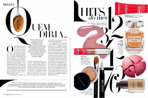
(Source: Harper’s Bazaar Brazil)
Failing to realise your idea visually, doesn’t always mean your idea was no good. Don’t question your ideas, but work on improving your designs. Here are some of the things to take note of when working on your next design project:
1) Choosing the right font (personality)
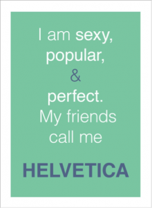
Are you aware that fonts have distinct moods and personalities? Don’t disregard Arial and Helvetica straight away. Always look at what you want to achieve before picking the font. Choosing the wrong font can convey different feelings and might even screw up your entire design.
For example, working on the design and layout for a fashion magazine, you most likely want to suggest modern, elegant and sophisticated tones – visually. You want to stay away from using Comic Sans or Papyrus fonts for the magazine, as it makes the entire design look unprofessional. The font you select needs to suit the personality of the brand.
(Source: AdWeek)
Never pick fonts just because you are awe of the particular typeface, in fact, you should choose the typefaces that suit your desired outcome.
“With millennials giving you less than 5 seconds to catch their attention, your typography needs to be spot on.”
2) No more than 3!
Never be generous with the use of fonts. Try to stick with one or two fonts for your design. Too many fonts might over-complicate the entire design – distracting the reader from what’s really important.
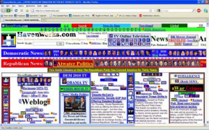
Remember websites in the 90s?
If you really want to use two to three different fonts in a design layout, avoid using fonts that look similar to each other (e.g. Bodoni and Didot). Visually similar fonts can be quite problematic, as they make your design look too indistinctive. Make it a family affair and use fonts from the same family, as it will give your design a more cohesive look. You might think that only one font looks boring, but ‘less is more’.
Let’s not forget, you can always play with the weights, styles and the width of the font. So, forget about the 90s and don’t use more than three fonts for one and the same design.
3) Do not stretch or squeeze!
Stretching and squeezing a font is definitely a big no in the world of design. Many people are tempted and love to stretch and squeeze a font just to make it fit a certain space. Stretching and squeezing a font does not only look odd, it also makes your design, brand and you look unprofessional. Instead, try to increase the size of the font to make it fit.
4) Don’t forget to kern it
Kerning refers to adjusting the spacing between letters – and is different from adding gaps by hitting space on your keyboard (don’t even think about it).
(Source: AdWeek)
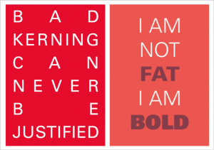
This is extremely important as it can make your design look a whole lot different. A good and bad design can be easily recognised and differentiated by just looking at the kerning. Hence, always remember to check the kerning before sending your final design to the client or the printer.
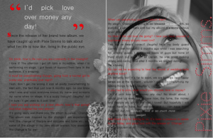
Nice smile, but that’s how you shouldn’t kern your design. (Source: Pixie Simms)
Mastering the art of kerning is especially important when it comes to creating your own font from scratch. Check out typemethod and practice your kerning skills until you get the hang of how it works.
5) Wipe out all the widows and orphans
If you don’t know what that means, you definitely need to pay attention now. Not many people will notice and identify the typographical widows and orphans. But if you want to tighten up your graphic designs you better start taking notice.
In the design world, a widow is a word that is left dangling at the end or the bottom of a paragraph, separated from the rest of the paragraph. While an orphan is a short paragraph that appears at the beginning of a column or page. One of the easiest ways to eliminate them is to rewrite or change the line ending. Another alternative is to manually edit the text or bring the text down to the next line.
6) The ‘ideal’ line width
Easily overlooked, a design’s line width is of importance too, playing a crucial role in the readability of the text. Wide columns usually won’t do your design any good, as they break the flow of the reader’s eyes when they jump from one line to the next. On the other hand, a narrow column might annoy your reader. Finding the balance is key to making it easy for the reader’s eyes to get through the article or text. Remember – the reader should be fully taken in by the content and not be distracted by the layout.
Never try to fit in all the words onto one line, as it might screw up the readability of your article. The perfect solution to a balanced line width is to keep it short. About 8 to 10 words or 50 to 60 characters per line is ideal.
7) Create a visual hierarchy
Think of what you want your viewers to look at first – only then you can embark on a design project. Everyone wants to create a design that looks good and captures people’s attention at a glance – so, make sure you don’t distract them with unnecessary stuff. Hierarchy plays an important role in design. It creates a flow, directs your eyes and allows your brain to process it easily. Hierarchy makes it easier for the viewer to distinguish what content comes first.
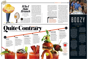
(Source: Pinterest)
You can learn how to establish a visual hierarchy by reading newspapers and magazines. Alternatively, you can try to play with the size, weight and spacing to achieve a visual hierarchy in your design. The more you practice, the more you will train your eyes.
Want sharp designs? Need to visualise an idea? Drop a message to [email protected]