It’s that time of year again where design trend forecasts flood the Internet.
Although design trends shouldn’t be the primary driver of brand identity and logo designs, they play a huge role when ideating short-term campaigns and staying relevant on social media.
At Mutant, we stay abreast with the latest trends to help our clients achieve their communications goals. Here are the five graphic design trends we’re most excited about in 2022:
Early 2000s Aesthetics: Nostalgia Still Sells
Image credit: Tumblr
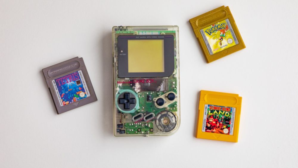
You may have noticed the resurgence of 90s visual cues over the past 2 years. Netflix’s Billion-Dollar Code is almost like a love letter to the 90s, and many brands that made it big in that era have proudly gone back to their roots through limited edition packaging and retro campaigns in the last year. With that said, we believe that the 90s aesthetics have reached a peak in 2021 and we’ll see more early 2000s aesthetics in 2022.
COVID-19 pandemic had an effect on the kind of visuals we’re seeing because it has an effect on the kind of visuals we desire to see. Texture became a big theme in graphic design as an overcorrection to the flat design trend back from 2018/2019.
In a world where glossy screens are dominating our attention, we crave the days of creased magazine pages and grainy photographs and those are exactly the things we saw in 2020 and 2021.
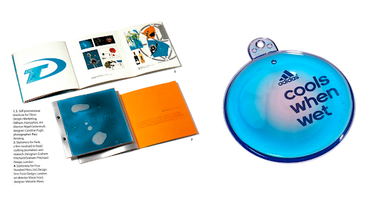
Texture isn’t going anywhere, but how it’s applied will. Gooey blobs (remember gel packaging?) and iridescent colours are already making appearances sporadically; look out for hints of the Nickelodeon green goo, Rugrats, Disney Channel, trading cards and MTV aesthetics!
The Bold and The Weird: Bright & Unorthodox Colour Schemes
Image credit: y2kmagazines, Apple
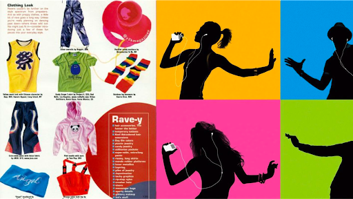
This trend ties into the previous one. If you thought the use of colours in the 90s were weird, Y2K took colours even further. The early 2000s were marked by the iconic iPod ads and halftone-heavy textures inspired by magazines and comic books.
The decade was also filled with uncomfortable colour combinations that somehow worked – think combos like purple and yellow, green and orange, and white and light blue. B2C brands will openly embrace this trend within the confines of their existing brand colour schemes, and it will be a pleasant surprise to see B2B brands follow suit.
Into The Metaverse: Giving Virtual Campaigns Another Try
Image credit: Meta
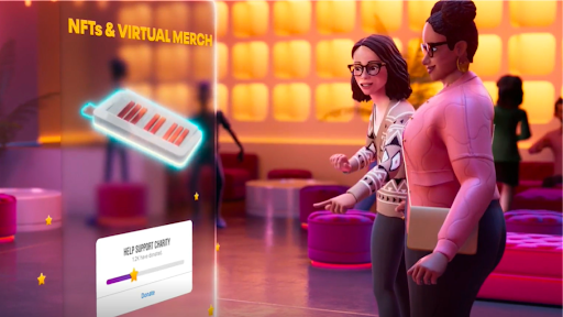
Hashtags for “meta” and “metaverse” have been trending ever since Mark Zuckerberg announced his ambitious vision to make the “metaverse” a thing, so don’t be surprised to see more visuals inspired by this idea. Keep an eye out for advertisements and social media campaigns featuring “build your own avatar” ideas, 3D virtual environments replacing photography, or even potentially interacting with real-life photography.
Because of this, we expect a revival of AR in brand activations. Some of the more daring brands might even toy with launching events within developing metaverses. Perhaps it’s time to give Second Life a second chance after work?
Serving Strange Looks: Type Distortion
Image credit: Junkee
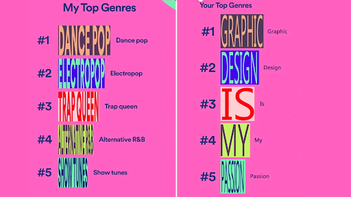
Wavy serifs, sunburst ultra-bold san serifs, trailing, disintegrating italics — distorted typography became popular at the end of 2020 during the height of the anti-design trend (looking at you, Spotify).
A word of caution: although type distortion can look great, graphic designers are generally trained to avoid distorting typefaces for the sake of legibility. But no matter how you may feel about it, expect to see more of this trend play out in 2022!
Making Moves: More Kinetic Logos
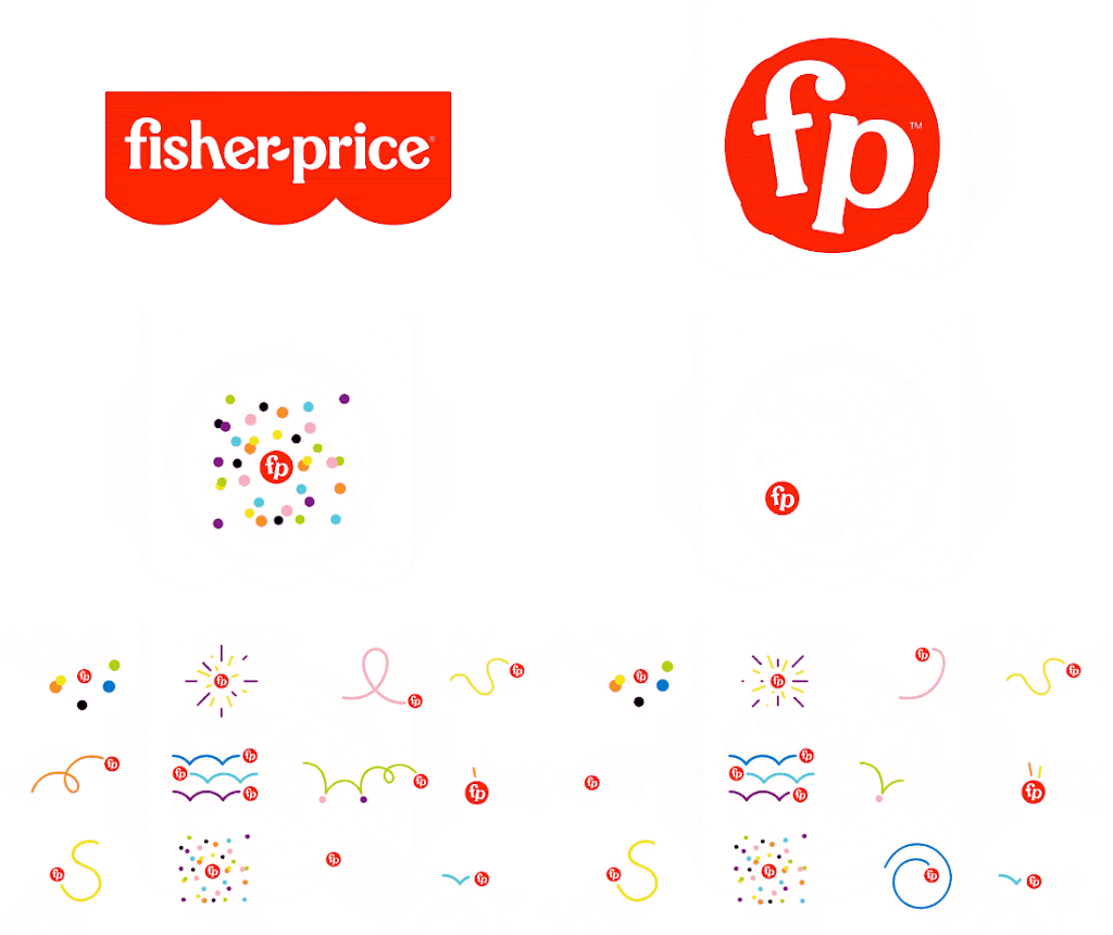
Image credit: Fisher Price Rebrand by Working Not Working
Motion design isn’t going anywhere. Social media is increasingly video-centred, as proven by Instagram’s shift from a photo-sharing app to an entertainment and video platform as TikTok continues its reign among Gen Zs. This means that the only way for brands to retain attention is to make anything that matters move. We have seen a gradual increase in animated logos since as early as 2018, and this trend is only going to continue in 2022 and beyond.
Perhaps it’s time to consider animating your current logo for splash screens, website navigation bar, and apps in your next rebranding exercise as animated logos can turn your brand identity into an organic system, just like Fisher-Price’s kinetic logo as shown here.
As a closing thought, it’s important to remember that trends are often precursors to changes in consumer behaviour. They serve as a good guide, but don’t feel pressured to follow every trend predicted on this list nor anywhere else!
The key to staying relevant is to evaluate these consumer behaviour changes and create an on-brand strategy for your target audience. Doing this not only addresses your customers’ needs, but increasingly solves their problems in creative ways. Now that’s a defining quality of trendsetters.
Want to be on-brand and in trend? Reach out for your branding and design needs at [email protected]

