Design trends are everywhere you look – whether they’re tried-and-true, retro, or brand new, the challenge is learning how to identify the one that will benefit a client.
This can be incredibly tricky – sometimes clients themselves even request that design trends be incorporated into their content, be it a seasonal campaign, social media posts, or an annual report. But from a designer’s perspective, brands don’t really need to jump on every trend if they already have a strong presence.
There are three things to consider when deciding whether to hitch your wagon to a trending design.
- Who is your target audience and how will they interact with this particular design? Will they appreciate it, be offended, or completely indifferent to it?
- As a brand, what are you trying to communicate when incorporating this design?
- How will the design reinforce the message you are trying to communicate to your audience?
Let’s take a look at three current design trends and what we think of them!
Colour gradients
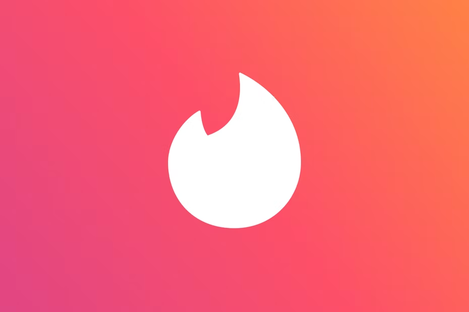 Logo – Tinder |  Social media template – Canva |  Skincare Packaging – Ahlens Aroma |
Over the past few years, the popularity of gradients has surged. Be it in logos, social posts, or packaging, the aesthetically pleasing colour grades are getting a lot of love – because who doesn’t enjoy a pop of colour once in a while?
Though a gradient is admittedly eye-catching, if no thought is put behind it, it becomes too abstract and fails to reflect or strengthen a brand in any way. Regardless of how pretty it is, we do think the internet is oversaturated with gradient content – and that makes it very hard for brands to stand out.
But if a gradient is a must for a client, then it’s important to find ways to make it unique to the brand. An easy way to do this is by ensuring that the colours used are part of a brand’s identity. As long as they don’t stray too far away from existing guidelines, it will fit seamlessly into the rest of the brand’s content or campaign and tick that design trend box.
Expressive lettering that doesn’t sacrifice legibility
 “Flow” by Rafael Serra on Behance |  “The Discourse” by Sam Eves | 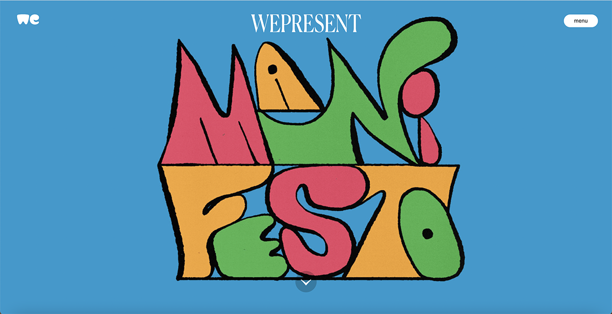 Manifesto by Bráulio Amado |
Expressive and experimental lettering is a funky trend that can bring mixed reactions. But playing around with this trend as a brand can create a very inviting and playful atmosphere, ushering in a refreshing take on a new campaign. Think of all the fun kinetic typography that could be produced!
That said, expressive lettering is a tricky one to execute without messing up the whole direction of a campaign. Balancing expression and functionality isn’t as easy as it seems, and it often becomes more of a challenge when creating for an audience that isn’t specifically into the artsy side of things. The risk with this trend is losing the message and overall legibility if the design is too experimental or expressive. But so long as the design expresses the context of the message and is legible, it can add dimension to the overall look. Should a brand jump on it? It’s definitely worth a try!
Analog vibes across digital media
 Artwork for Big Write Hook magazine by Ryan the Designer |  Tim Saunders |  Nike – Makers of the Game |
Let’s talk about the grunge revival. Grunge often gives off a very DIY/punk look, and is widely used for digital zines and album covers today. It’s very analog and out of all the other design trends, this one has the most physical presence. This can feel both nostalgic and refreshing, especially considering we’ve all been stuck at home and online for the past couple of years. Amongst the myriad clean and minimal digital designs on the internet, grunge artwork will definitely draw some attention. There’s something about the juxtaposition of something so textured in digital form that scratches our brains just right.
The downside of this trend is that the textures can sometimes make the artwork look “dirty”, which is not what most brands strive for. But if a brand wants to try this look out, we think it’s worth getting a design to try their hand at executing it.
Though it is very tempting to jump on every aesthetically pleasing design, it’s important to remember that brands don’t have to follow all of them to stay relevant. But if it fits into a campaign or the social content strategy and will convey the message a brand is looking to tell, then playing with trends can pay off – just be sure to really consider it holistically and have a sit down with the designers so that everyone can figure it out together.
Need help figuring out an art direction? We can help: [email protected]